

Simpl-ified Design System

Secondary Button
Secondary Button
Secondary Button
Amazon Pay
Primary Button
Primary Button
Primary Button
Lorem Ipsum
Lorem Ipsum
Title goes here
Body(maximum can go up to two lines)
Link button

Title goes here
Body(maximum can go up to two lines)
Link button
Unifying product experience, improving activation and delinquency rates with a centralized design system


Overview & Impact.
Team
Product Designer: Smriti, Himanshu Vishwakarma, Ayan Aggarwal
Principal Product Designer: Neeraj Chandaver
Design Manager: Muktai Joshi
Duration
08 Months (November 2022 - June 2023)
Tools
Figma, Collaboration, Creativity and a whole lot of planning.
Design and Strategy
Prior to the Design System initiative, Simpl faced challenges common to fast-growing fintech companies: inconsistency and technical debt. Multiple product teams, operating under high pressure, led to a fragmented user experience (UX) and an unsustainable code base.
Our strategy was to treat the Design System not as a library, but as a product that serves all other products. This required a foundational, atomic approach combined with a strong governance model.
Impact
Delinquency Reduction:
Achieved a 10% reduction in user delinquency by ensuring a consistent, trustworthy UI for all critical payment and repayment flows.
Activation Improvement:
Improved activation rates for both new and repeat users through standardized onboarding and feature adoption components.
Cost Savings:
Resulted in cost savings of approximately ₹7 lakh per month in reduced engineering time and overhead.
Experience Unification:
Established a single, scalable system for all feature and offer cards across the billing cycle, eliminating fragmentation and confusion previously caused by disparate component styles.
Development Velocity:
Drastically reduced development effort by enabling teams to build with pre-vetted components rather than recreating UI elements, ensuring a consistent and scalable UI across the entire application.
Problem Identification:
Simpl's rapid growth outpaced its design and development structure, creating critical risks that impacted both user trust and business performance.
Fragmented User Experience
A lack of shared visual language meant UI components were inconsistently styled across different product areas, leading to a diluted brand identity and increased cognitive load.

Devlpmnt Inefficiency & Tech Debt
Teams built bespoke UI solutions, resulting in massive code duplication and brittle components. This slowed feature delivery and increased the surface area for bugs.
WCAG Non-Compliance
Existing designs frequently violated WCAG contrast ratios, creating significant accessibility barriers and legal/ethical risks, particularly in areas involving transaction confirmation and error messaging
State Management Failure
Constant "real estate" battles as Product launch, repayment info, engagement banners, and marketing teams constantly fought for prime display space, resulting in a cluttered, unscalable UI.
Problem Research:
The initial phase focused on thoroughly diagnosing the pain points inherited from the previous, unmanaged design environment. This research had two primary tracks: Product/System Audit and Stakeholder/User Discovery.
System Audit
Stakeholder Discovery
Component Inventory
Cataloging every unique UI element (buttons, inputs, cards). The goal was to quantify the extent of design sprawl.
Visual Language Analysis
Auditing existing files against brand guidelines. This specifically included a WCAG compliance check.
Code Synchronization Audit
Working with Engineering to map existing front-end components to design files to quantify the design-to-code debt.
Cross-Functional Interviews
Conducting structured interviews with Designers, Engineers, Product Managers, and Marketing lead focusing on bottlenecks.
User Behavior Mapping
Analyzing existing user flows to understand where design fragmentation was directly causing friction or drop-off.
Problem Solution:
Our strategy was to treat the Design System not as a library, but as a product that serves all other products. This required an atomic, token-first approach built on a strong governance model that mandated prioritization..
Atoms
By establishing these Atoms first, we created a robust, systemic consistency that carried through the entire Repayment Journey—from the initial due date notification on the Homepage, through the steps on the Repayment Page, and onto the final Success Page. We created Typography, Color, Icon and Logo Libraries.
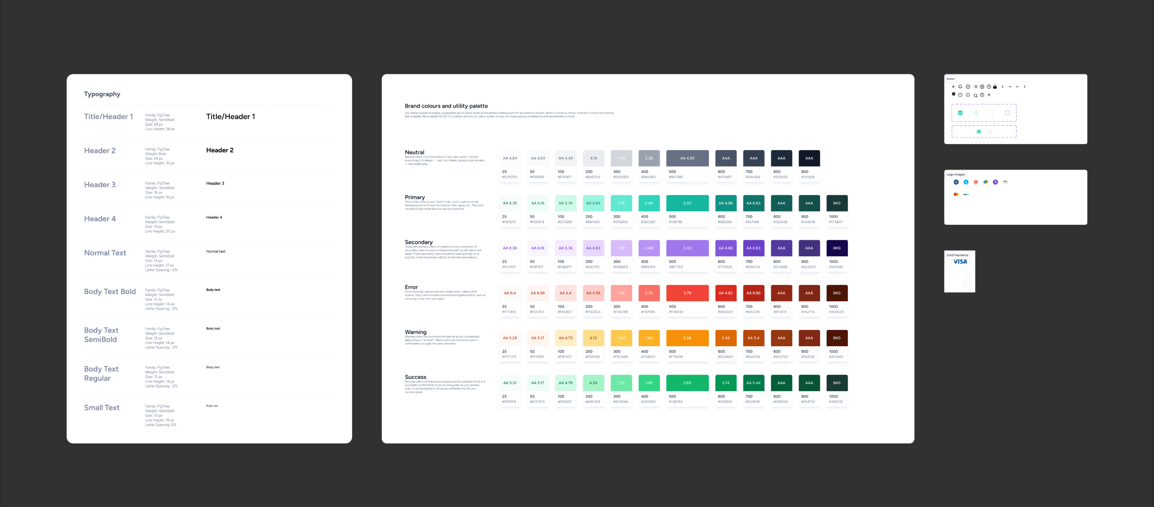
Snapshot of Atoms - DS
Molecules
I created core Molecules by combining Atoms to form simple, functional UI units: the Text Field, Sub Headers, Button, and Info Label. These Molecules were the essential connective tissue used to construct all the interactive modules within the Repayment Journey, ensuring consistency in every user action and status update.

Snapshot of Molecules - DS
Organisms
I created core Organisms by combining Atoms and Molecules to form complete, reusable interface sections: Navigation Header, Payment List Item, Card, and Recommended Section. These Organisms provided the large, systemic consistency necessary to build the main Homepage, the structured Repayment Page, and the final detailed Success Page with speed and reliability.

Snapshot of Organisms - DS
Usage and Impact: Delivering Business Value
This systematic approach stabilized the critical Repayment Journey and delivered measurable Impact, including the 10% reduction in delinquency, significant improvement in activation, WCAG compliance for new components, and cost savings of approximately ₹7 lakh per month through reduced development effort.
Usage.
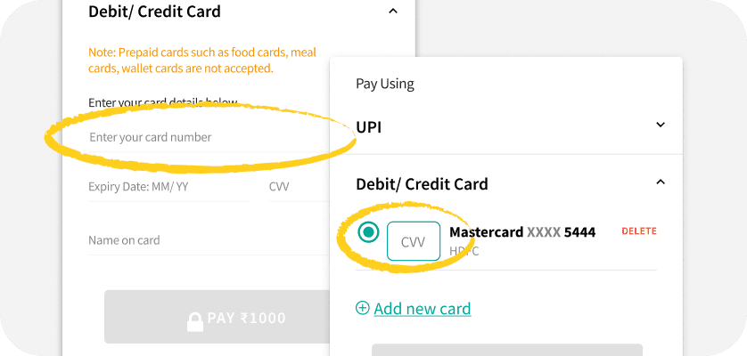
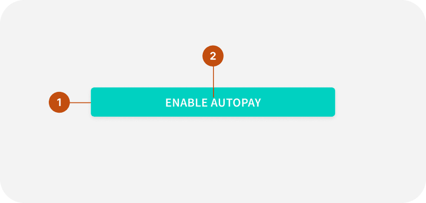
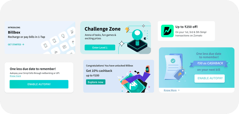
The system's success lay in its rigorous state management, distinctly applied across core and promotional elements. Homepage Card management enforced clarity on transactional status, handling states for Low Balance, Bill Due, Overdue, and Autopay Status to keep users informed of their immediate financial status. Separately, the Homepage Carousel used strict priority logic to systematically display Product Launches, Marketing Campaigns, Challenge Zones, and Offers, resolving the prior screen real estate battle. Furthermore, the Repayment Card and its final success/failure components provided consistent, clear feedback throughout the entire transactional lifecycle, reinforcing user trust.
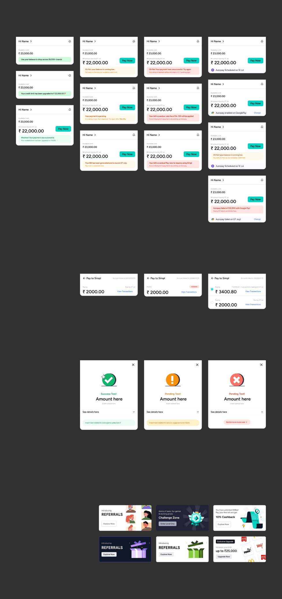
Homepage Payment States
Repayment Card States
Success/ Failure States
Homepage Carousal Cards
Content
View more work related case studies?
Explore all narratives

Let’s build
meaningful stuff together.
Made with curiosity, care and kindness. 🙌
In collaboration with GenAI 😉