




Contention Report: Designing AI - Human Collaboration

Turning complex invoice disputes into transparent, actionable change requests
that bridged the gap between insurers and repairshops.
Intro
At Tractable, the core technology leverages image AI assessment to analyze vehicle damage photos and repair estimates. For global clients like GEICO and ATIC in the US, this technology was used for
different insurers after a repair is completed).
subrogation (resolving retrospective disputes between
For clients like Warta in Poland, it was applied to
review (providing live
feedback on active repair estimates before the car is fixed).
Despite these different business use cases, both products followed a similar operational loop: following an accident, a network body shop takes photos of the damaged vehicle and writes an initial estimate, which is then run through our platform where our AI automatically flags discrepancies - such as a shop recommending a costly replacement when the damage can be repaired. Loss adjusters evaluate these AI-generated flags, choose to agree or disagree with each recommendation, and send these change requests back to the body shop to adjust their prices.
The Bottleneck: The Contention Report
All agreed upon disputes - spanning physical vehicle repairs and auxiliary invoices like Rental, Towing, and Storage (RTS) - are compiled into a single document - the Contention Report.
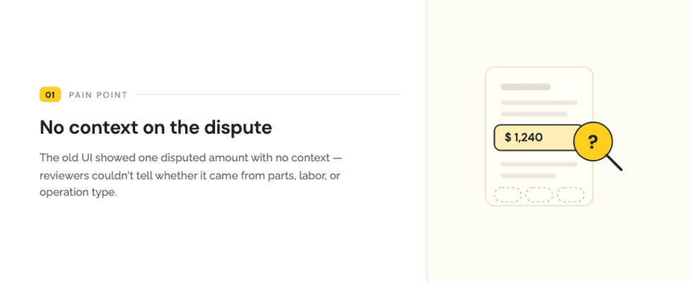
The legacy interface of this report had a major flaw - it showed a flat list of disputed amounts without showing why the AI flagged them, or what the repair shop actually needed to change.
"This wasn't an accuracy problem - it was a trust and transparency problem.
Our AI engine could flag a discrepancy perfectly, but the interface didn't explain the logic behind its decisions to the humans who needed to act on it."
Discover
Mapping of how a Contention Report gets created across Tractable's two products. Review serves European carriers with live feedback, while Subro helps US carriers recover costs after a repair. Even though the markets are different, both products follow the exact same workflow. Every path ends at one shared artifact - the Contention Report - which is where we focused the design. For this process, Claude.design was used to generate the product workflow from user study from ATIC and Product Manager.

User research with enterprise loss adjuster and an audit of the legacy platform revealed five critical human-system design failures:
Insight 1
Insight 2
Insight 3
Insight 4
Insight 5


The Review Report
The manual calculator
Define
To design an interface that bridges the gap between disparate business models, clear definition of the contrasting humans on both sides of the Contention Report.
A. Key Stakeholders & Personas
Loss Adjuster
Body Shop Manager


The Loss Adjuster
Evaluates hundreds of high-value claims weekly · ~3–4 min each
GOAL
Assess AI flags, confirm real errors, and compile a clean change request with exact financial accuracy.
Motivation
Prevent overpayment and keep every calculation aligned with carrier guidelines.
Frustration
Forced into manual math and disjointed databases just to justify an AI recommendation.
The Body Shop Manager
A busy repair-shop owner who receives the final Contention Report
GOAL
See exactly which repair operations or rates the carrier wants changed — to accept or re-estimate.
Motivation
Avoid getting locked into adversarial arguments with insurance adjusters.
Frustration
A flat, non-negotiable list of disputes with no visual explanation — triggering counter-disputes and delays.
This matrix maps out how both personas interact with the system throughout a single contention lifecycle, outlining goals, emotional states, and opportunities for design intervention:

With our target personas and journey opportunities clearly mapped, we entered the Develop phase to translate these abstract problem areas into an operational SaaS interface. This phase was defined by rapid, cross-functional iteration and close alignment with engineering timelines.
A. Rapid Prototyping, Alignment & The Golden Path
To bridge the gap between complex database capabilities and user interfaces quickly, the ideation process by generating layout variations using Claude design and Figma Make for logical UI data structures and Figma for high-fidelity interactive prototyping.
Rather than working in a silo, we established a continuous feedback loop by sharing these early interactive concepts with Product Managers (PMs) and Customer Success Managers (CSMs) (representing our client carriers ATIC, GEICO, Sompo, and Warta).
Alignment on a clean visual direction that balanced deep backend technical complexity with upfront simplicity.
To optimize our tight 2-month timeline, we adopted a "Golden Path" parallel engineering model. We defined the "Golden Path" as the primary, high-volume happy path: an adjuster successfully reviewing and completing a standard physical repair contention with no errors or tax anomalies (handling 80% of daily volume).
By locking down the UX framework and layout for this primary path early in Figma, we established a reliable structural contract between the frontend UI and the backend data architecture. This allowed our DevOps and engineering teams to begin building the core database schemas, pipeline integrations, and XML parsing engines in parallel. Because the standard system plumbing was unblocked and being built by developers, we gained the crucial design runway to investigate, test, and design complex edge cases, rate rules, and Phase 2 modules without slowing down the development team's sprint velocity.

B. Phased Rollout Strategy
To ensure a highly stable release, we broke down the finalized design approach into two structured development phases based on business priority and technical complexity:

C. Translating Insights to Systemic Requirements
To resolve these friction points, we translated each identified pain point into a structural, human-centered design intervention.

D. Technical & Product Constraints in Repair Contention
Designing an enterprise system means balancing optimal user experience with rigid technical and business limitations. During the development of the Phase 1 Repair Contention module, we navigated two major product and engineering constraints:
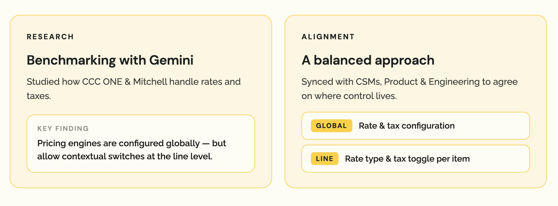
1. Rates and Taxes Management (Global vs. Line-Level Control)
We engaged in extensive cross-functional discussions with the product team regarding where adjusters should be allowed to modify taxes and labor rates. The question was: should these financial changes apply globally at the estimate level, or should adjusters have granular, line-by-line control?
2. Resolving PDF Parsing Inaccuracies
A significant technical hurdle was dealing with parsing errors from scanned or poorly formatted estimate PDFs. If a line item was incorrectly ingested by our OCR and parsing engine, the system's automated calculations broke down, preventing adjusters from raising accurate contentions.

E. RTS Contention Negotiation: Balancing Trust with MVP Scope
Designing the RTS Contention section required a very different UX approach. RTS billing is math-heavy, relying on customized daily rate multipliers (e.g., Daily Rate × Number of Days = Subtotal).
The Proposed UX Solution: we proposed giving adjusters an interactive RTS calculator upfront in the interface. Under this model, the user would only need to update the basic parameters and the system's backend would automatically handle all the complex multiplication, tax addition, and subtotal updates in real time.
The Engineering Constraint & Pushback: The engineering team strongly pushed back against building an interactive frontend calculator widget for the MVP due to tight timeline constraints. They proposed only showing the final "adjustment amount" field upfront.
The Negotiation & Compromise: To hit our strict launch window, we agreed to defer the interactive, input-driven calculator to V2.


Change-request language with old value to new value
Each contention row shows: old value (red strikethrough) then new value (accent colour). All three dimensions - Operation type, Part cost, RLH - are visible at a glance.
Auto-calculated totals at section and report level
"Section impact" auto-sums each section's rows. The summary bar shows "Total queried amount" in real time. No manual arithmetic needed.
Separate sections per category
"Repair Estimate Changes" and "Rental / Tow / Storage Changes" are distinct sections, each with their own contention count badge and section impact total.
Plus Add contention button per section
Each section has its own "+ Add repair contention" / "+ Add RTS contention" button.
Deliver: Handoff, Async Alignment & Parallel QA
With the design phase completed, the final step was ensuring a rapid, high-quality execution. The handoff and rollout plan was optimized to maintain momentum while keeping all cross-functional stakeholders aligned.
A. Validation of Phase 1 designs: Repair Contentions
Once we aligned our designs with the business and tech teams, we came up with the final set of designs for Repair Contentions. To validate our direction, we tested these interfaces directly with Michael, a senior loss adjuster from ATIC.
The feedback was exceptionally positive; Michael remarked on how much cognitive strain it would eliminate from his daily workflow, validating that the visual diff and segmented totals resolved the core trust issues. With this strong validation, we closed Phase 1 and immediately transitioned our focus to designing the second critical component of the platform: RTS (Rental, Towing, and Storage) Contentions.
B. Validation of Phase 2 designs: RTS Contentions
For RTS Contention designs, we conducted an interactive walkthrough session with the development team. For CSMs, I recorded an interactive, high-fidelity Loom walkthrough video. In this video, we walked through the core design decisions, the visual math-evidence fallback, and how it would simplify life for both loss adjusters and body shops. This async approach was a massive success.
C. Parallel Design Quality Assurance (QA)
To prevent downstream delivery delays, we didn't wait for a fully polished build to begin QA. As soon as the developers spun up the initial staging environments, we kicked off a collaborative, parallel QA sprint.
To keep track of state changes, complex math calculations, and interface behavior across different carrier rules, we created a shared Excel QA Tracking Sheet. This allowed the design and product teams to test the working front-end code against planned layouts in real time. It had links to Storybook for correct component implementation etc.


To know more details about the case study, lets connect:)
Have less time, want to quickly glance through case study?
Explore all narratives

Let’s build
meaningful stuff together.
Made with curiosity, care and kindness. 🙌
In collaboration with GenAI 😉