


Meesho Claims Design: Quick Study

Transforming a cluttered claims process into a clear, stress-free experience for sellers.
Intro
Overview & Impact.
As a Product Designer, I was responsible for the end-to-end design of the new claims dashboard, working closely with a design lead and cross-functional partners.
Research & Insights:
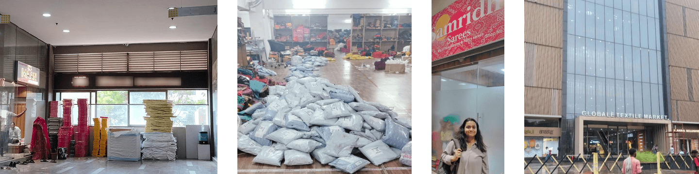
I conducted on-ground field studies in Surat, meeting with eight sellers to uncover their core frustrations. This was complemented by competitive benchmarking with Amazon, Flipkart, and Snapdeal to inform our strategy.
Design & Strategy:
I led the claims dashboard design, creating user-centric wireframes and high-fidelity prototypes based directly on user feedback. I also conducted usability testing with 12 Meesho sellers to validate and refine our final designs before preparing the files for developer handoff.
Cross-Functional Collaboration:
Consulted with product leadership: Mr. Kirti Varun (CPO), Mrs. Priya Sankaralingam (Product Director), and Mrs. Leena Jacob (Design VP) to align them for claims dashboard.
Produced weekly update presentations, set clear meeting agendas and goals, and ensured continuous communication with product manager and developers throughout the design process, driving project alignment and efficiency.
Collaborated with Visual Designer - Prachi Gautam for brainstorming and ideating the visual assets.
Outcomes:
The redesign led to a direct and significant impact on our key metrics:
Improved NPS: We saw a significant drop in detractors.
Engagement: We saw a significant Daily Active Users (DAU) for the new claims module, proving the design's usability and value.
The Challenge
Meesho's mission to democratize e-commerce is reflected in their zero-commission policy, which helps anyone start a business without investing in the platform. It had over 1.1 million sellers in 2023. The Seller panel though faced — a huge detraction when it came to returns/payments/claims experience.
A growing trust deficit emerged among sellers. The lack of transparency and clarity in the claims process challenged the fundamental user behavior of building a successful business on Meesho. For sellers, it created a dilemma: continue on the platform or switch to alternatives.
What is Meesho Claims?
Meesho's Claims Policy allows sellers to claim compensation for RTO (Return to origin - order cancelled by customer before delivery) and Customer Return (order cancelled by customer after delivery) shipments that are wrong, damaged, or have missing items. To claim, sellers must raise a ticket within 7 days, providing mandatory ideo evidence of unboxing (showing packaging and labels) along with product and reverse waybill images.
Fragmented Process
Trust Deficit
No Actionable Feedback
A Fragmented & Inefficient Journey.
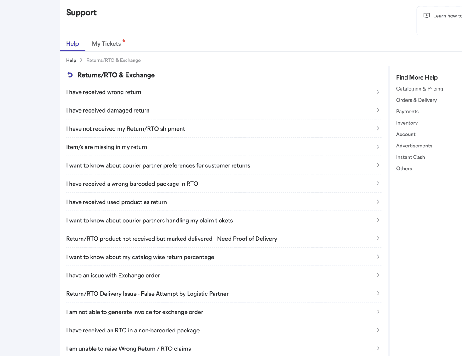
The existing process for raising and tracking claims was chaotic. Sellers were forced to navigate between two separate tabs-Support and Returns-to find and manage their claims. This wasn't just confusing; it was deeply inefficient.
The Problem
Raising a Claim: When sellers attempted to raise a claim, they faced two poor options. The first was to navigate the support tab, where they had to select from a long, confusing list of dispositions before filling out a lengthy form. Alternatively, they could try to raise a claim contextually from the returns tab, which was not easily discoverable. Worse yet, even when they used the contextual option, they were redirected to the same generic support form, forcing them to manually re-enter all the order information-rendering the contextual flow futile.
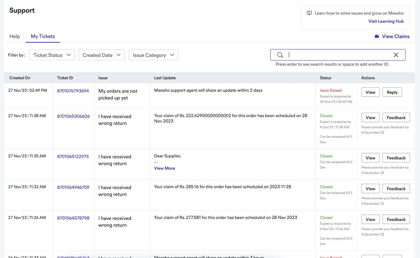
Tracking a Claim: This process was equally broken. While a "Claims Tracking" sub-tab in the returns dashboard provided helpful identifiers and statuses, clicking on a ticket would redirect the user to the support tab. This was the wrong user behavior, as tracking from the support tab was a chaotic experience-claims tickets were mixed with general support queries and lacked critical identifying information in the table, forcing sellers to open each one to see its status.
The Impact
This friction was so significant that sellers were abandoning the official panel and turning to third-party software like Wisdom and OMS Guru to streamline their workflow. This behavior highlighted a core failure in the user experience: it was simply easier to use an external tool than Meesho's own platform. The manual use of spreadsheets to track claims also proved that our current data was insufficient.


Problem
Contextual Claim Raise against returns not available upfront.
Problem
Contextual Claim Raise is at L2 level.
Problem
None of the data from return Table is retained.
The form filling process is tedious.
Returns Tab
Claim Raise Issues
Claim Tracking Issues
Returns Tab
Support Tab
Support Tab
Support Tab
Returns Tab
Problem
Huge list of dispositions, while only 8 of these are related to claims.
Sellers are unable to pick the right disposition most of the times.
Problem
The View CTA takes user back to Support Tab.
Problem
The identifier and Claim Status is missing.
The claim Tickets are mixed with other support tickets.
This fragmented journey became our primary focus. We knew that building a single, centralized claims dashboard would not only improve usability but also restore seller trust and keep them on the platform.
The Transparency & Trust Deficit.
Beyond the fragmented journey, sellers like Arun were operating on a foundation of distrust. The dashboard's metrics were confusing, creating a frustrating disconnect between what they saw and what they experienced.
The Problem
The existing "Total Approved Claims" metric was misleading. In one dashboard, it showed an approval percentage with no underlying breakdown or context, leaving sellers to guess which claims it was even referring to. In another dashboard, it showed all-time claims data, which was irrelevant to a seller's day-to-day business.
The Impact
This lack of transparency eroded trust. When a seller saw a high approval percentage but their own spreadsheets showed a different, more chaotic story of partial payments and pending claims, they questioned the platform's honesty. This data opacity was a core contributor to the "trust deficit" you mentioned earlier.
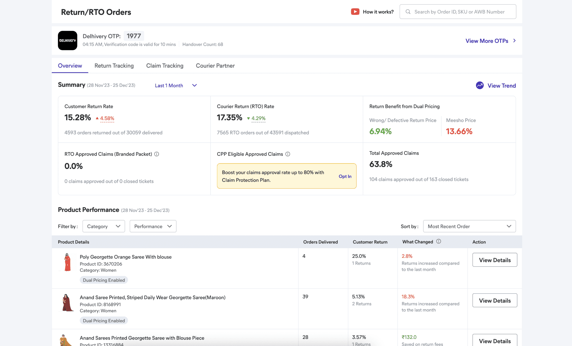
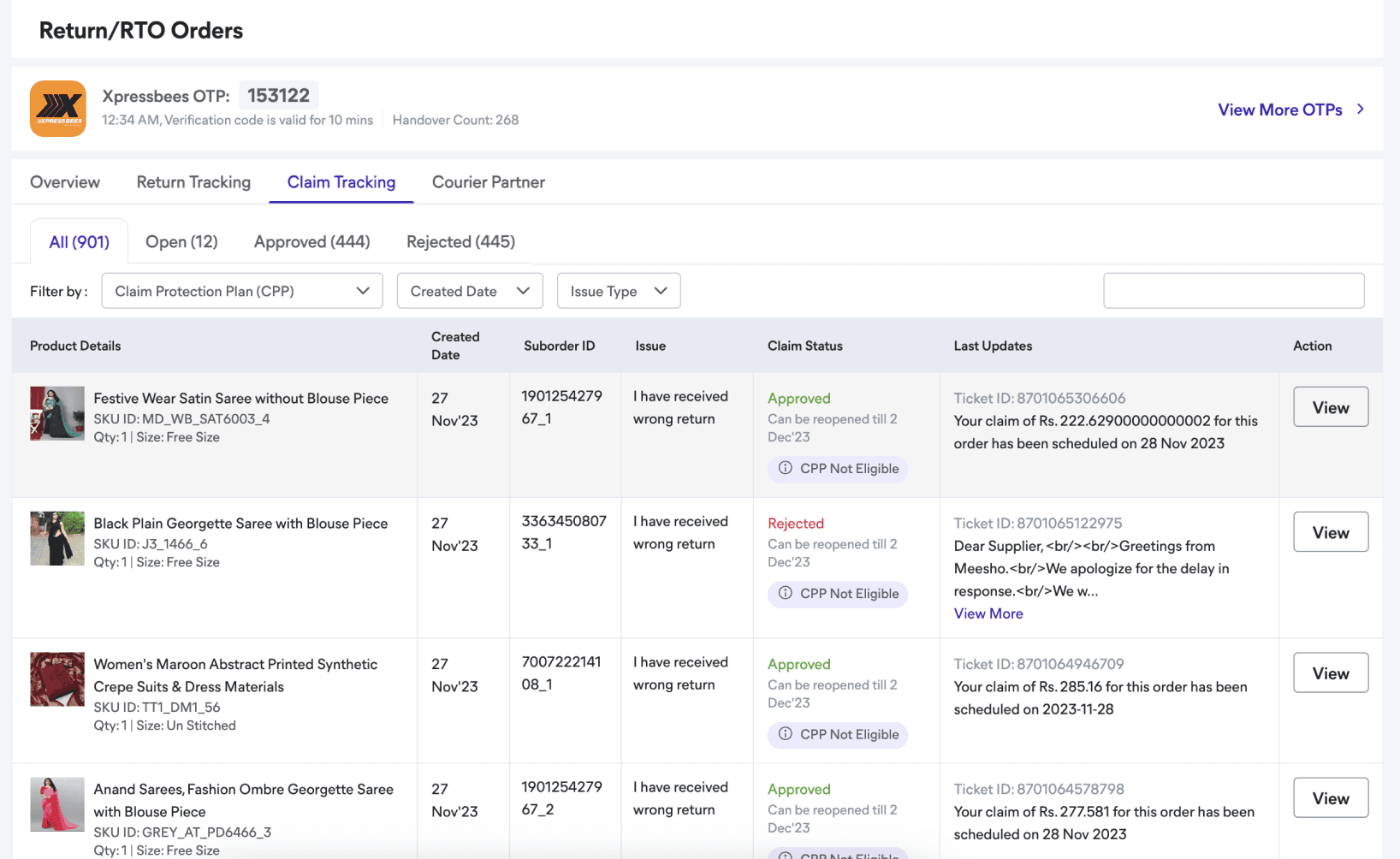
Problem
Metrics is placed in Return dashboard without context.
There is no L2 level of information telling about 104 claims that are approved.
Returns Tab

Problem
Seller manually calculated their own approval rate—by using these no. on claim tracking sub-tab, 444 approved claims out of 901 raised—they arrived at 44%. This number sharply contradicted the 63.8% shown on the returns dashboard(shown above).
This insight made it clear that we couldn't just create a new dashboard; we had to design a system that was fundamentally transparent. We needed to build an experience that didn't just show numbers but explained how those numbers were calculated, restoring faith in the data and the platform itself.
The Lack of Actionable Feedback.
The final and most frustrating pain point was the one that made sellers feel powerless. Even when they managed to raise a claim, the process offered no actionable feedback on why a claim was rejected or if it was missing information.
The Problem
The support tickets that were meant to be a source of information were a dead end. They contained templated responses and no specific reasons for a rejection. Even worse, there were no notifications for when a claim needed "more info" from the seller's side. This meant that claims were being denied not because of a seller's error, but because they simply missed a notification in a sea of other support tickets.
The Impact
This lack of transparency and proactive communication forced sellers to constantly check their tickets, a tedious and time-consuming process. It created a situation where sellers were losing money due to the platform's poor usability, leading to either a loss of revenue or the need to hire additional staff just to manage claims.

Problem
The notification system is redundant in setting priority from most important to least important
This insight showed us that our new dashboard had to do more than just display data. It had to be a tool for empowerment, actively guiding sellers and providing clear, actionable feedback to help them improve their claim success rates.
1
2
3
The Approach
Unify Experience
Build Transparency
Proactive Feedback
Unifying the experience.
Solving for - A Fragmented & Inefficient Journey
Our primary research made it clear: the seller's chaotic claims experience was a critical problem that needed a dedicated solution. After aligning with product leadership, we made a core strategic decision to build a dedicated claims module that would serve as a single source of truth for all claims-related data.
Strategic Placement
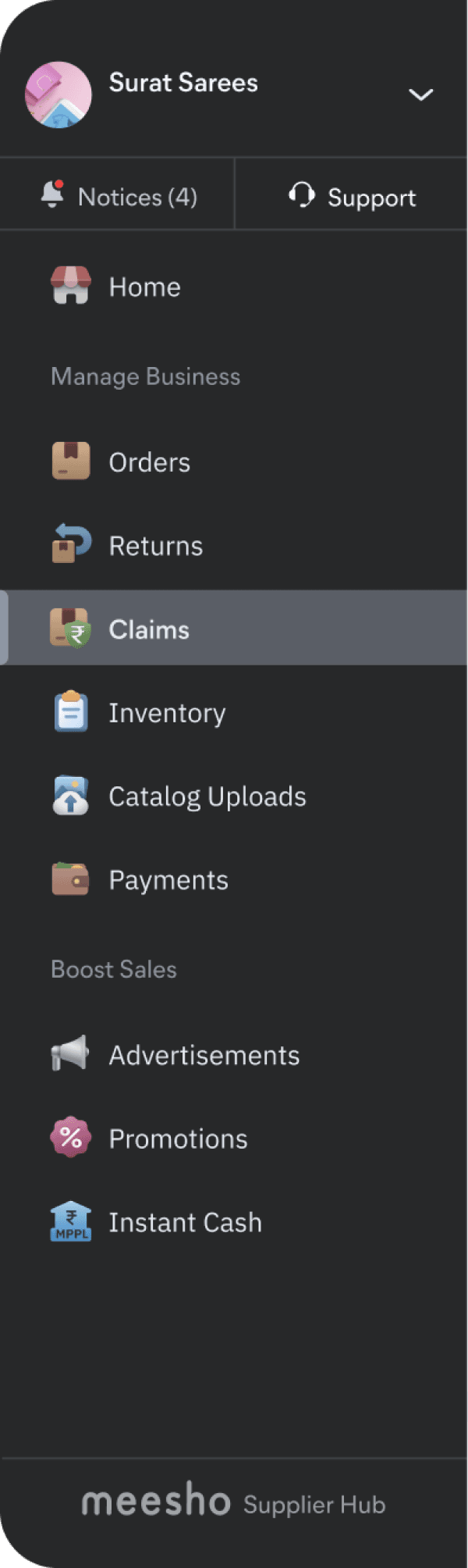
We decided to give the new claims module a permanent home in the main left navigation. This placement ensures easy and prominent access, eliminating the need for sellers to search across different tabs.
Strategic Placement

Raise Claim
Claims
Simplified Placement
A primary "Raise Claim" button within the new claims tab

Raise Claim
Raise Claim
Contextual Placement
Contextual button next to the relevant return item
Contextual and Simplified Journeys
Setting the Stage for the Future
While the redesigning claims raising journey was a massive step, we scoped the full claims-raising flow for a V2, which will further improve the user journey.
Restoring Trust Through Transparency.
Solving for - The Transparency & Trust Deficit
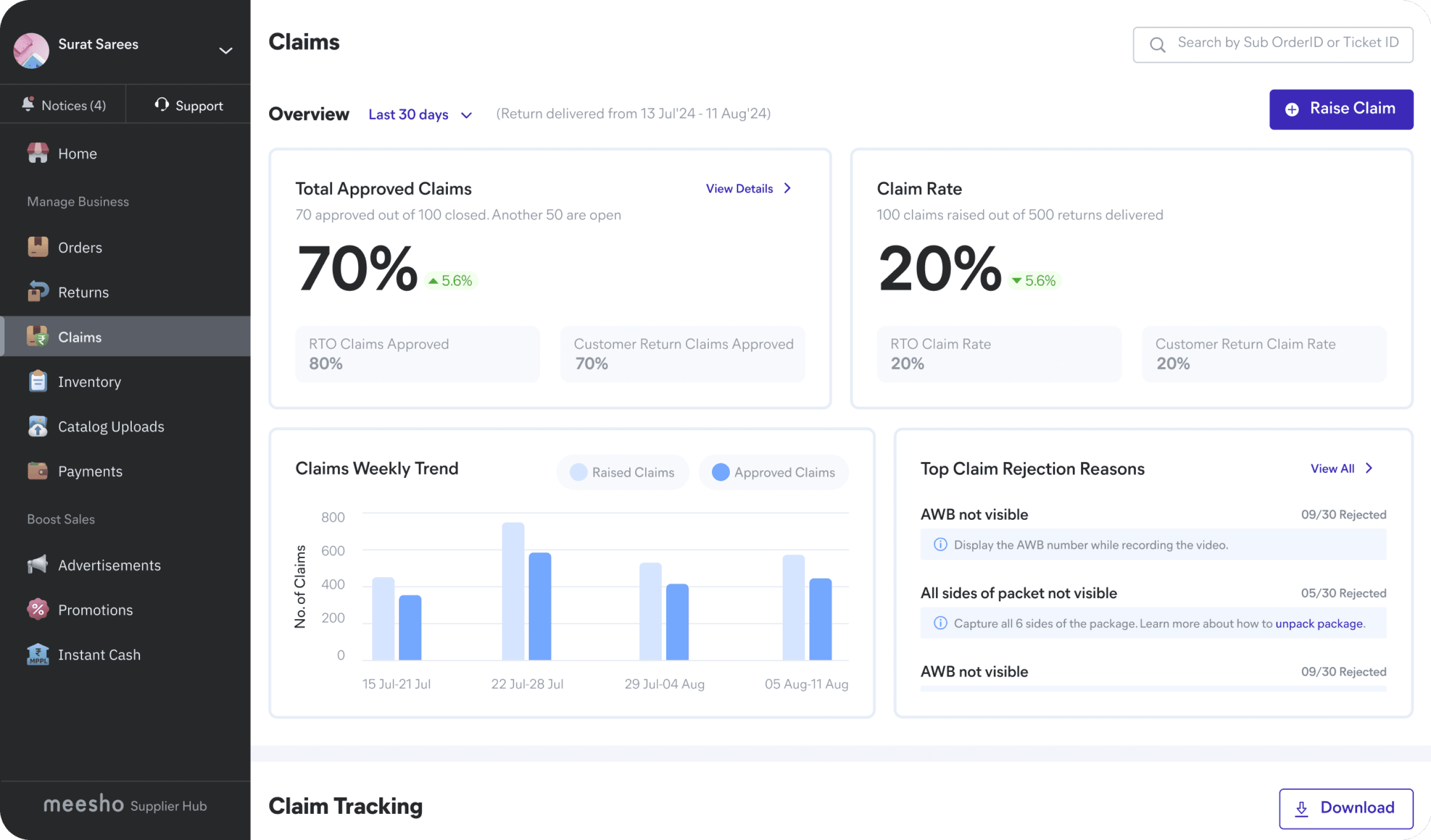
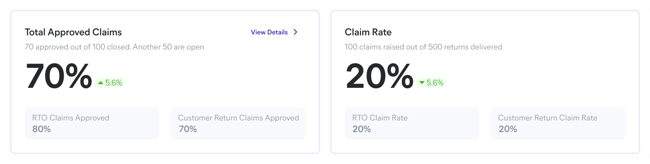
A New Approach to Metrics
We replaced the misleading "Total Approved Claims" percentage with a new set of relevant business metrics, including "Total Approved Claims" and "Claim Rate." This gave sellers a clear view of their performance on the platform. We also placed funnels for RTO and Customer Returns directly on the dashboard. This allows sellers to see the most critical information at a glance, eliminating the need to search through multiple tabs.
Transparency
"View Details" call-to-action that provides a complete breakdown of metric
Weekly Tracking Metric

Transparency
To help sellers monitor the health of their return journey via claims weekly approval.
Actionable Insights
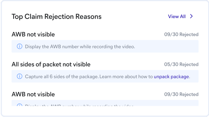

Take ownership & improve future claims
The "Rejection Reasons" section gives sellers direct feedback on why their claims were rejected.
A Proactive Feedback Mechanism.
Solving for - The Lack of Actionable Feedback
To combat the lack of actionable feedback and empower sellers, we redesigned the claims tracking system to be clear and proactive.
Improved Table Visibility
We first redesigned the claims tracking table to provide clarity at a glance.
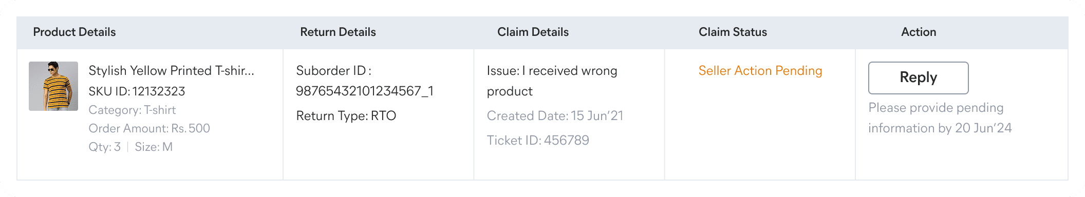
Image placeholder with product info for easy identification.
“Claim Status”that clearly explain the status of each claim
When seller needs to take action to further process claim.
Actionable Sub-Tabs
We introduced a dedicated "Seller Action Pending" sub-tab. This simple but powerful feature clearly groups all teh claims that needs seller to provide additional information, preventing them from missing a critical update and losing out on a claim.
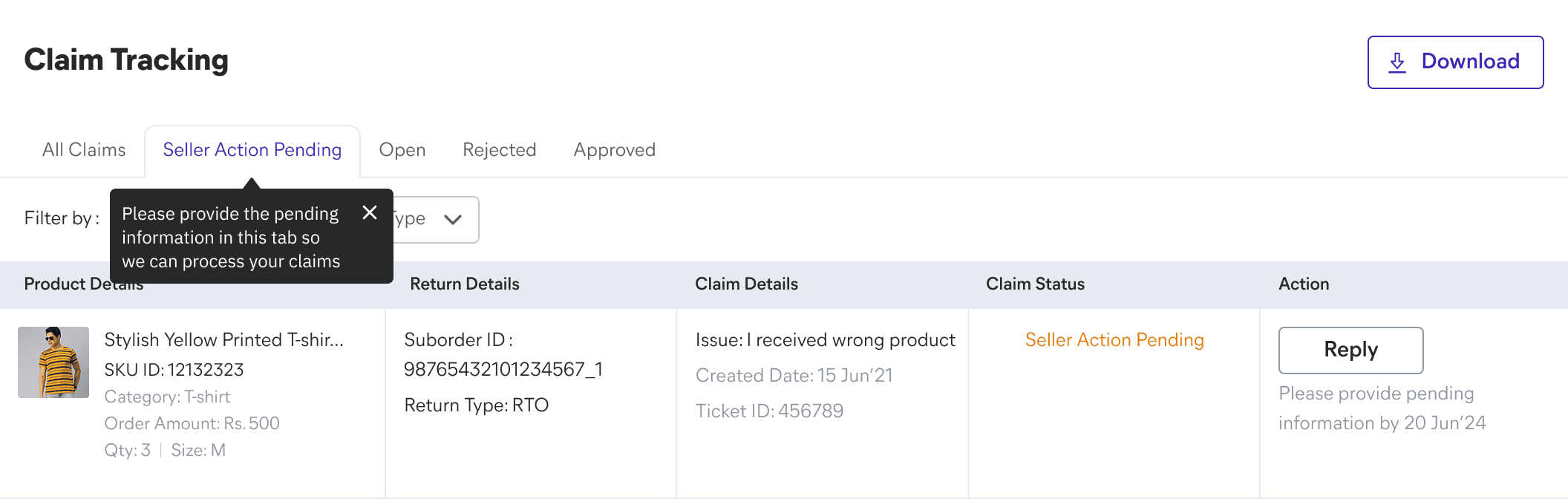
Proactive Notifications
To ensure sellers never miss an update, we implemented a "pill view" notification system. These small visual cues appear in each sub-tab to alert sellers whenever there's a new approved, rejected, or open claim, or if action is required on their part.

Empowering Data
We added a download button to the claims tracking table so that sellers can easily export their data for their own monthly financial calculations.
This small but crucial feature empowers sellers by giving them full control over their own data.
Seller can customize download by selecting filters OR switching tabs
The Outcome
The Resolution: A Clear, Stress-Free Experience.
The final design is a direct response to the core frustrations of sellers. It unifies a fragmented journey, restores trust through transparency, and provides actionable feedback. The new Claims Dashboard is not just a visual update; it is a tool that empowers sellers with the clarity and efficiency they need to grow their business with Meesho.
Designed for Scalability.
A core principle of the dashboard redesign was scalability. The metrics overview section was built using a flexible, modular layout designed to accommodate immediate and future business needs. Currently, the section displays key metrics like Approved Claims and Claim Rate, but the grid framework is ready to seamlessly integrate two additional metrics (e.g., CPP or Branded Packaging) without requiring a costly redesign. Similarly, the Claims Weekly Trend graph uses a dynamic component built to effectively display up to six data points, ensuring the visualization remains clear and readable as we increase the reporting frequency. This forward-thinking approach ensures the product can evolve with the business.
Outcomes & Impact.
After a final design review with product leadership, the designs were handed off to the developers for implementation. We continued to collaborate closely, designing for key edge cases and iterating as new product requirements, like user activation, emerged.
The results were a direct validation of our user-centered approach.
Improved NPS: We saw a significant drop in detractors, with the score improving to 14% after the claims approval rate surpassed 70% in the initial rollout. This proved that a transparent, usable experience directly builds trust.
Positive Engagement: The new claims module achieved a remarkable 47% of daily traffic, with 35,000 daily active users out of a total of 75,000. This showed that our solution not only improved the experience but also drove significant user adoption.
Lessons Learned & What's Next.
This project taught me the profound impact of clarity and transparency on building user trust. While the initial rollout was a success, our next steps included focusing on new user activation and the reactivation of existing sellers to continue growing the module's usage.
Want to dive deep and read the whole thing?
View Full Case Study

Let’s build
meaningful stuff together.
Made with curiosity, care and kindness. 🙌
In collaboration with GenAI 😉